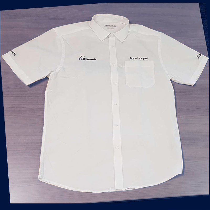
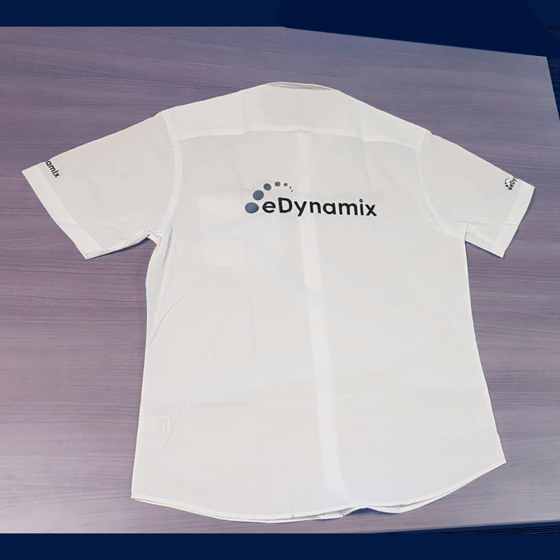
Logo redraw and promotional items
After using the old version of the eDynamix logo on various forms of print, we decided that it needed strengthening with a bold font. It made a great improvement making it easier to work with when applying to promotional items. The beanies were a giveaway at the latest exhibition and the shirts were worn by staff who attended.

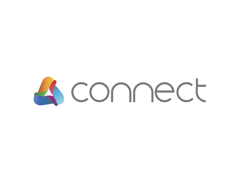
Connect & growing the brand
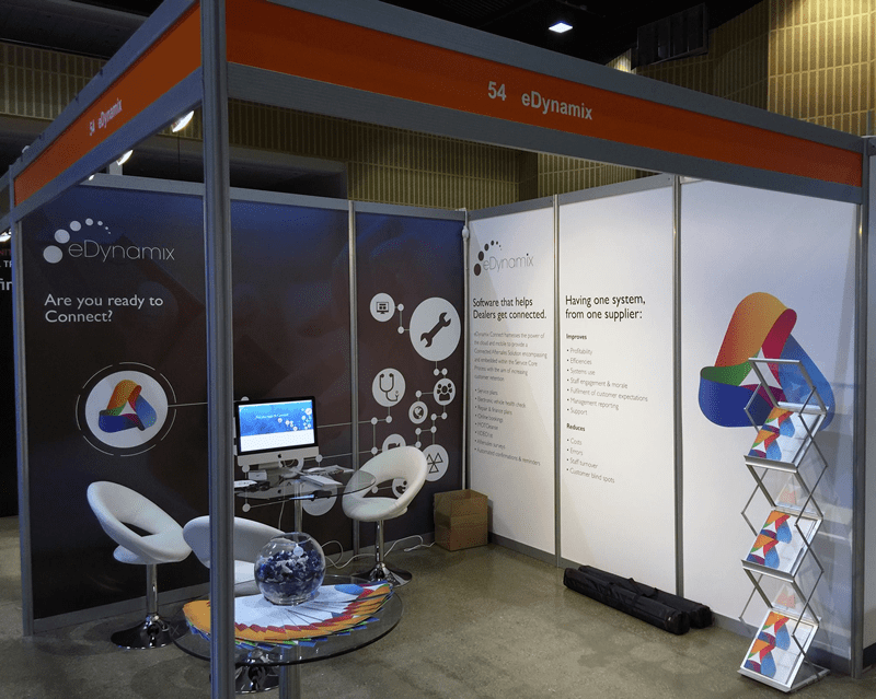
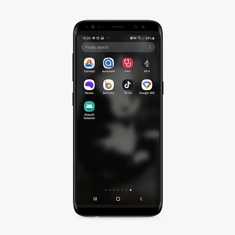
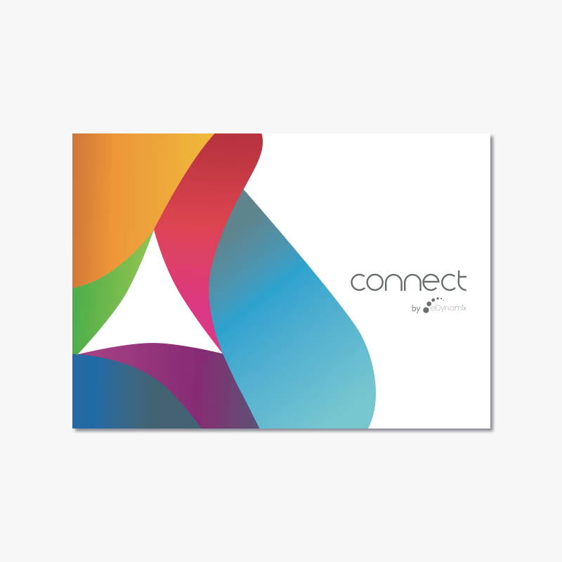
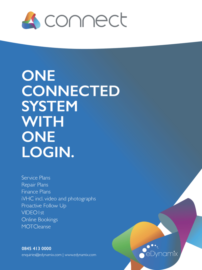
I was asked by the Director to produce a ribbon like logo with a spectrum of colours running through it to represent the integrated, connected sales & aftersales products. This is where Connect was born and used widely throughout all media and advertising including: a brochure of products, business cards, an app and digital banners. I illustrated the text which was then turned into our own eDynamix font. This was then applied to some of the new module logos that are sold or offered to dealerships.
The selection of adverts below used in AM, Car Dealer and Workshop magazines show the development of the brand. I started incorporating the ribbon in earlier artwork when we had specific colours for each product.

Once the products started to develop, we had to step away from the use of colour in their identity. We kept the consistency of the thin icons that I had used to identify them, including those that didn’t have a logo.


I found that gradients applied to photography were a popular choice from the feedback of the team so started introducing more of this.


I developed a branding pack with all of the product identities, use of fonts and logos. This also included a colour palette with codes.
